As January approaches, it's time to tackle some long overdue home renovation projects. A new year requires a few simple accomplishments around the house, and few are more rewarding than a fresh coat of paint. And while white has been the preferred backdrop for every makeover, things are changing quickly.
Homeowners still love neutrals, but neutrals with depth. Think earthy hues that add warmth and life without overwhelming your walls, and “tones that seem down-to-earth and natural rather than bright or austere,” notes Dallas designer Lauren Saab. These neutrals create the ideal balance: subtle enough for everyday wear, but stylish enough to instantly elevate any room.
It's time to get your New Year's painting resolutions started, and these 10 designer-favorite neutral colors offer an easy starting point.
Credit:
Courtesy of Farrow & Ball
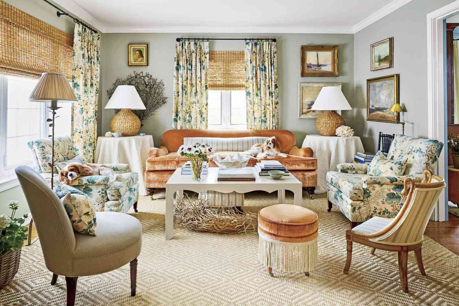
Jitney, a muted brown, is prized by Southern designers for its versatility. “It's the perfect neutral as it has this warm, sun-kissed, sandy undertone that pairs well with wood, stone and all woven textiles,” says Saab. The relaxed paint color provides a base on which artwork, furniture and architectural details take center stage.
“We used Jitney in the kitchen of a recently remodeled mid-century home in the 1960s,” says Arkansas designer Whitney Romanoff. “It adds the perfect inviting warmth, touch of romance and femininity.”
Credit:
Courtesy of Farrow & Ball
If you're looking for a neutral shade with substance, look no further than French Gray from Farrow & Ball. “Its classic 19th-century French roots can create the most calming interior. It makes a statement without being loud,” says Alabama designer Nicole Roby.
Credit:
Courtesy of Benjamin Moore
For Florida designer Libby Baker, Revere Pewter is a chameleon shade. “In some lights it looks gray, in others it looks a warm beige. It can even look a little green, but it's very subtle,” she says. She suggests using it as a transition color or for furniture.
Credit:
Courtesy of Sherwin-Williams
“Moscow Midnight” is atmospheric, elegant and expressive. While it may not be for everyone, it's a favorite of Texas-based stage artist Andress Eichstadt because it can anchor a palette in the same way black or navy blue can. “It feels like the dawn after a hot day, cool enough to refresh, yet velvety and full of life. It gives you properly realized drama, soulful depth without heaviness.”
Credit:
Courtesy of Sherwin-Williams
Every designer needs a delicate neutral in their color palette, and Sherwin-Williams' Lattice achieves exactly that. “At first it looks gray, but depending on what light comes through the window, it may look a little blue or greenish, but it looks clean and refreshing,” says designer Allison Smith of Gem & Clay Interiors.
Credit:
Courtesy of Sherwin-Williams
Yellow can certainly be neutral. Florida designer Lauren Leonard likes a “pale, buttery yellow like Sherwin-Williams' Full Moon. It goes well with all greens, aquas and blues and would look wonderful in a cottage or in an elegant, formal living room,” she says.
Credit:
Courtesy of Farrow & Ball
For Sarah Stoksad of Fresh Eyes Design, moving away from all-white is about creating cozy spaces that feel bright, light and fresh at the same time. “The key is to layer tones and textures and use colors with warmer undertones,” she says. “We love Farrow & Ball colors like Light Blue, Pigeon and Setting Plaster (yes, that pink can be neutral!)”
Credit:
Courtesy of Benjamin Moore
Designer Liz Williams' neutral shade is Edgecomb Gray, a soft, warm greige that is timeless and inviting. “As people move away from the cooler grays of the past, they are increasingly looking for a cozier and more natural feel.” This shade offers just enough warmth while still remaining light and versatile.
Credit:
Courtesy of Clare
It's time to go beyond a simple base color and show off layered art and home furnishings. Another favorite of Romanoff's is Clare's Rain Check. “If you squint, you might think it's a soft white at first glance, but it's the perfect cool green and soft blue tone that always feels fresh and inviting. We love this, especially in the bathroom or breakfast nook,” she says. The designer recently used it in a boys' bathroom with bunk beds in Fayetteville.
Credit:
Courtesy of Sherwin-Williams
The neutral trend seems to be moving toward more complex beige-greige colors, warm organic colors that don't go too gray and don't look orangey-beige, says Trina Rogers of Five Star Painting of Temple. One of her favorites, Sherwin-Williams' Shiitake, is a backdrop for warmer, softer, nature-inspired interiors.