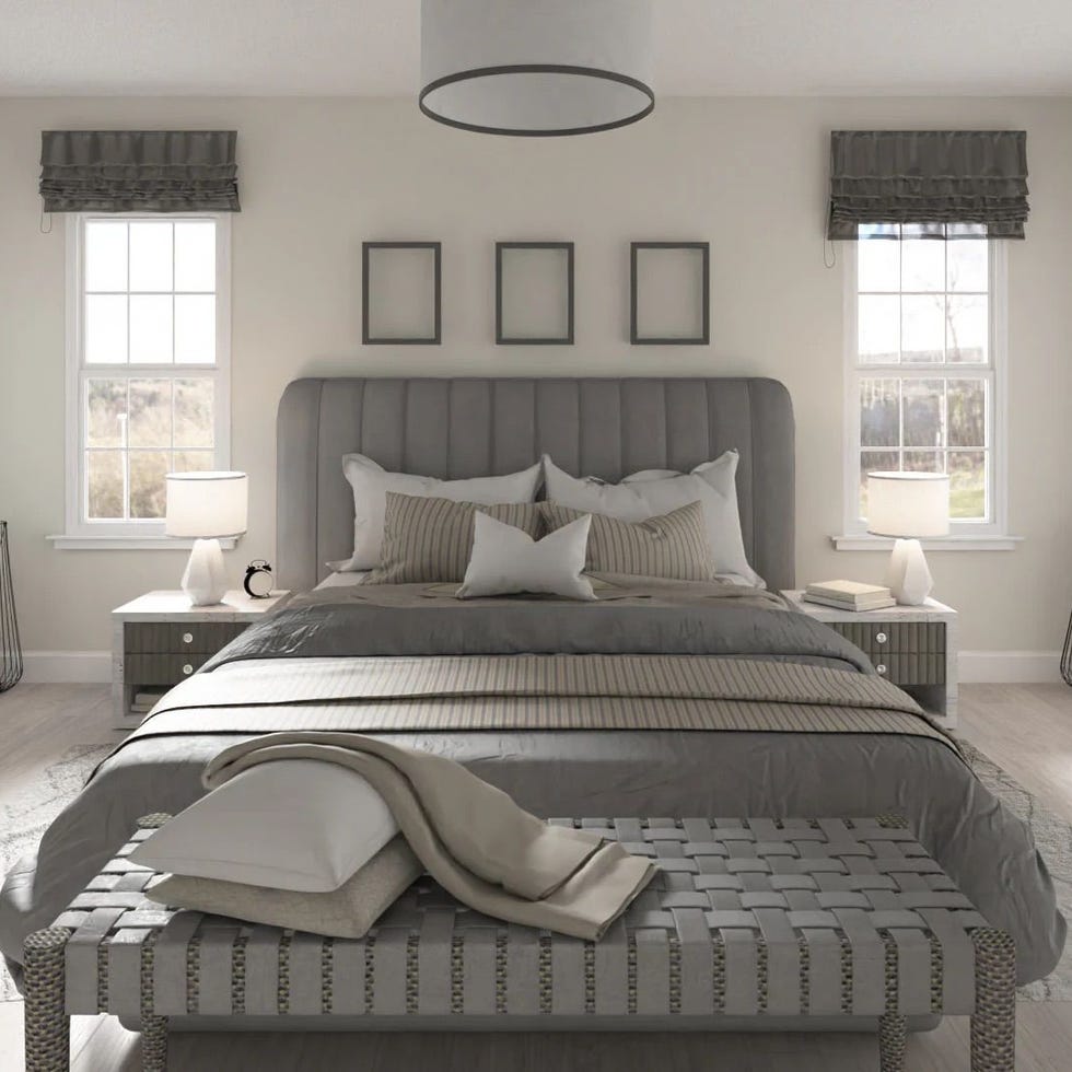
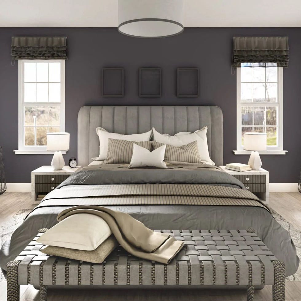
Regardless of your personal decorating tastes, one thing applies: color has the power to determine the overall mood of your home. Soft blues and muted greens have a calming effect, while vibrant hues like bright yellow immediately bring cheer. But if you want to add a more sophisticated, upscale touch to your space? Designers have an ideal palette for this. Although trends change, certain timeless hues continue to take over when customers want a home that feels elegant and upscale—and we asked the experts exactly what their top picks are.
Think rich oxblood, timeless navy and creamy, warm whites – these colors instantly elevate the aesthetics of a room. Whether you complement it with statement furniture or go all out with monochromatic walls, trim, and ceilings, the design impact is impressive. To illustrate its power, designers have even shared real-world examples from their own projects. Read on to see which 11 colors pros swear by to create a luxurious, expensive-looking home.
Navy blue
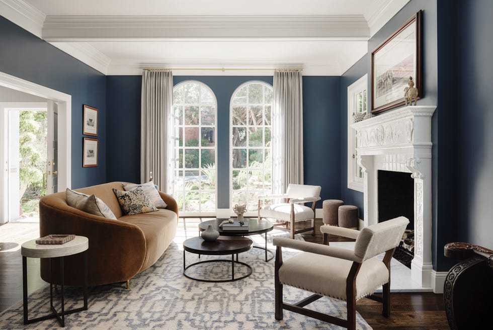
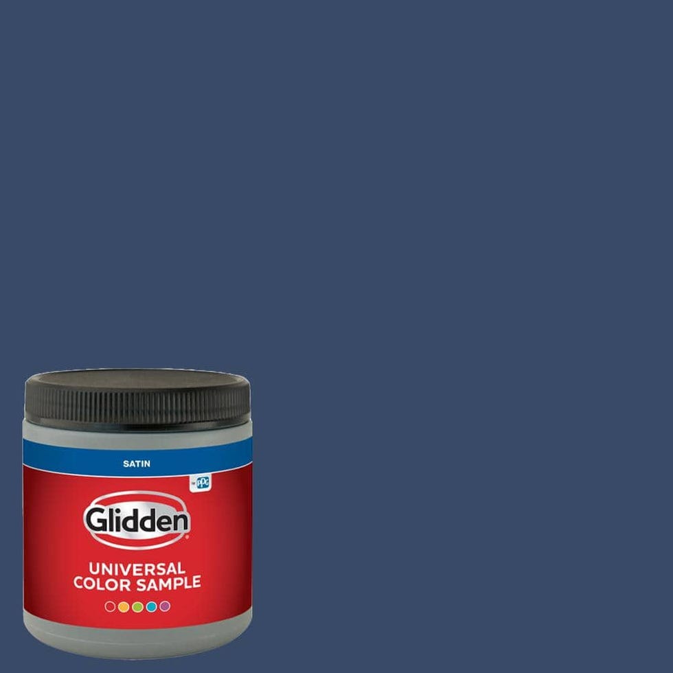
Navy blue may become trendier from time to time, but it is a timeless color that numerous designers turn to when trying to give a room a sophisticated look. Designer Laura Elliott of Refined Interiors points out that this shade has a calming effect, reminding us of the sea and the night sky, but is also endlessly versatile, especially in living rooms and kitchens.
To pair this moody hue with another color, designer Brynn Olson suggests jewel tones. “Think deep purples, magenta, golds, and emeralds. While ivory is always a classic complement to navy, we especially love combining warm golds with deep blues for a dramatic, rich effect,” says Olson.
Olive green
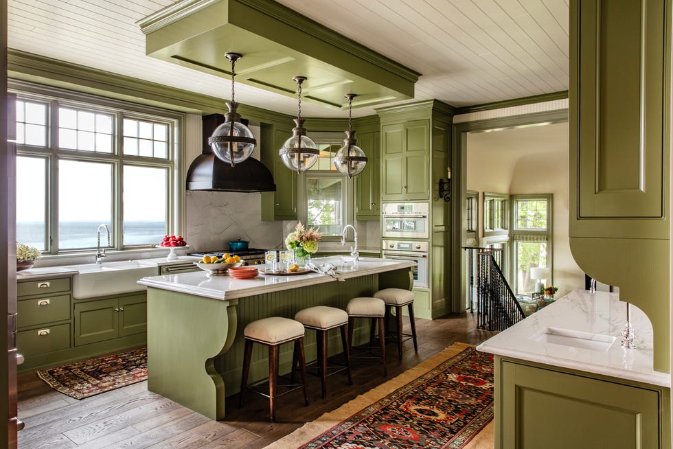
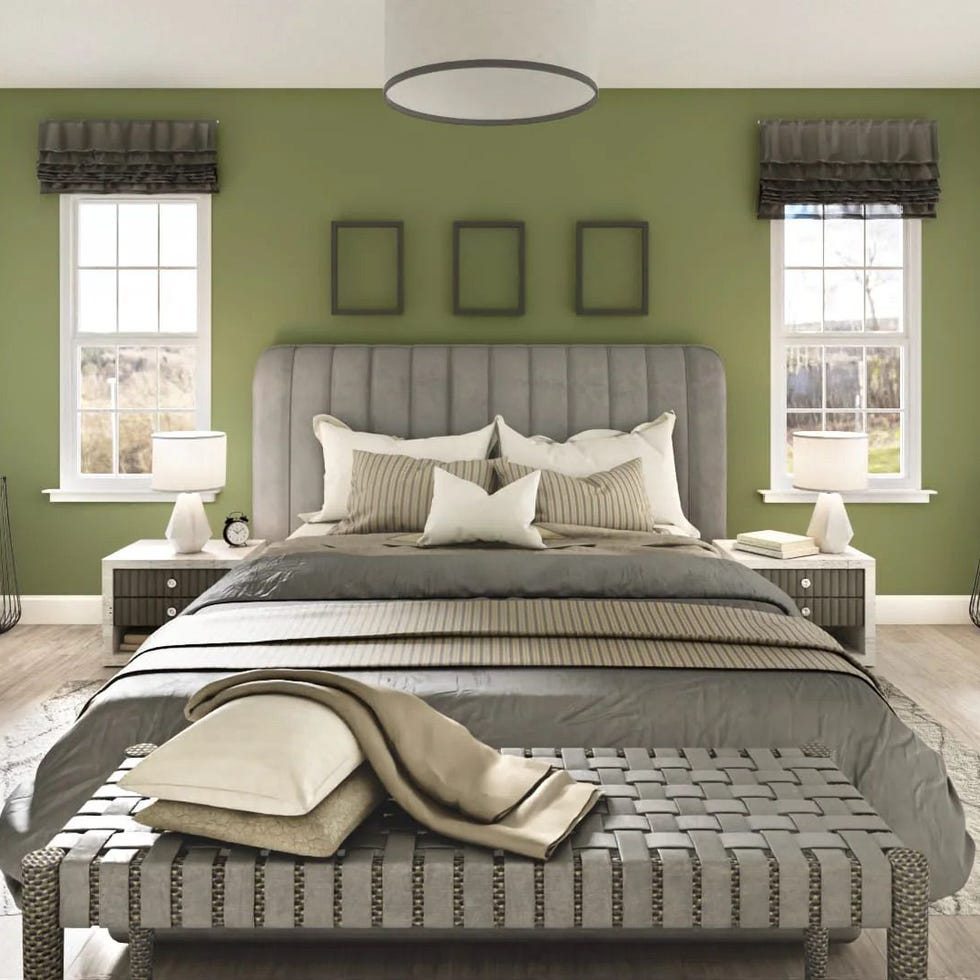
This dark shade of green is popular for good reason: It can “transform any room into a rich, calm oasis,” says designer Kaitlyn Murphy of Marguerite Rodgers Interior Design. It's an adaptable shade that looks just as beautiful anywhere on the walls as it does just to accentuate trim and doors. Kelly Sutherland likes to paint ceilings with it, using a smooth, semi-gloss finish to make a room feel cozier and more elegant. It works equally well in modern and traditional environments as it adds sophistication.
Olive green can look good next to virtually any other color, but this earthy hue works best with brass, bright white, light oak, and camel. It's also a wonderful alternative to black if you want to add more color to your home.
Oxblood
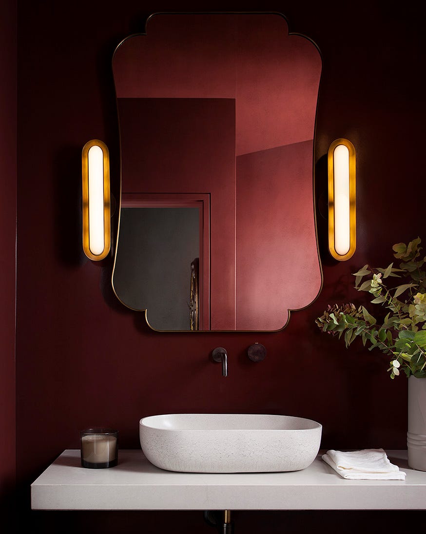
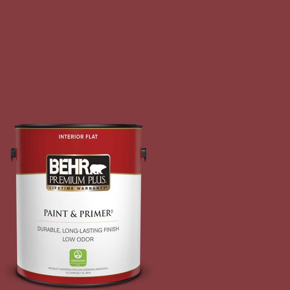
This deep red hue is quickly becoming a favorite of designers and design lovers. “A deep and moody wine red, this rich, dramatic hue embodies the luxurious essence of aged wine, evoking sophistication, craftsmanship and timeless appeal,” explains Laura Britt of Britt Design Group. Oxblood creates depth, capturing the attention of the person who has just walked through the door and enveloping them in a luxurious atmosphere.
Designer Piper Skillman suggests using this hue in a library, media room, or dining room—somewhere that already has an air of elegance. Because it's so enveloping, it can make a small room feel even cozier, making a large room with high ceilings the best option for pops of color.
Britt and Skillman both love combining oxblood tones with soft neutrals to balance boldness, and black or dark gray for unexpected edge and drama.
Dark teal
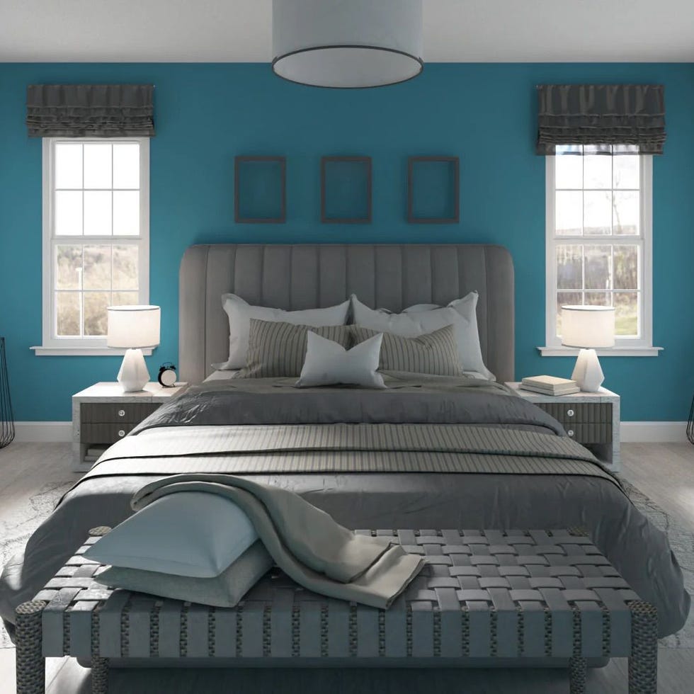
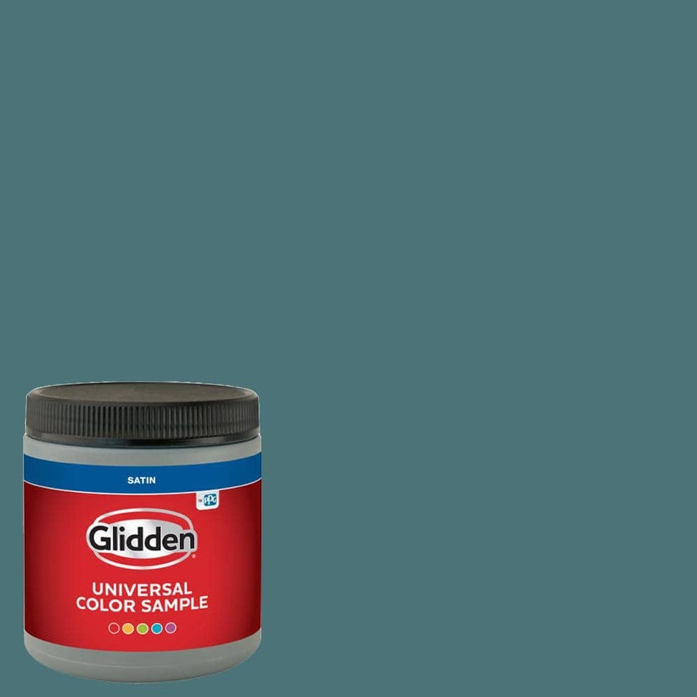
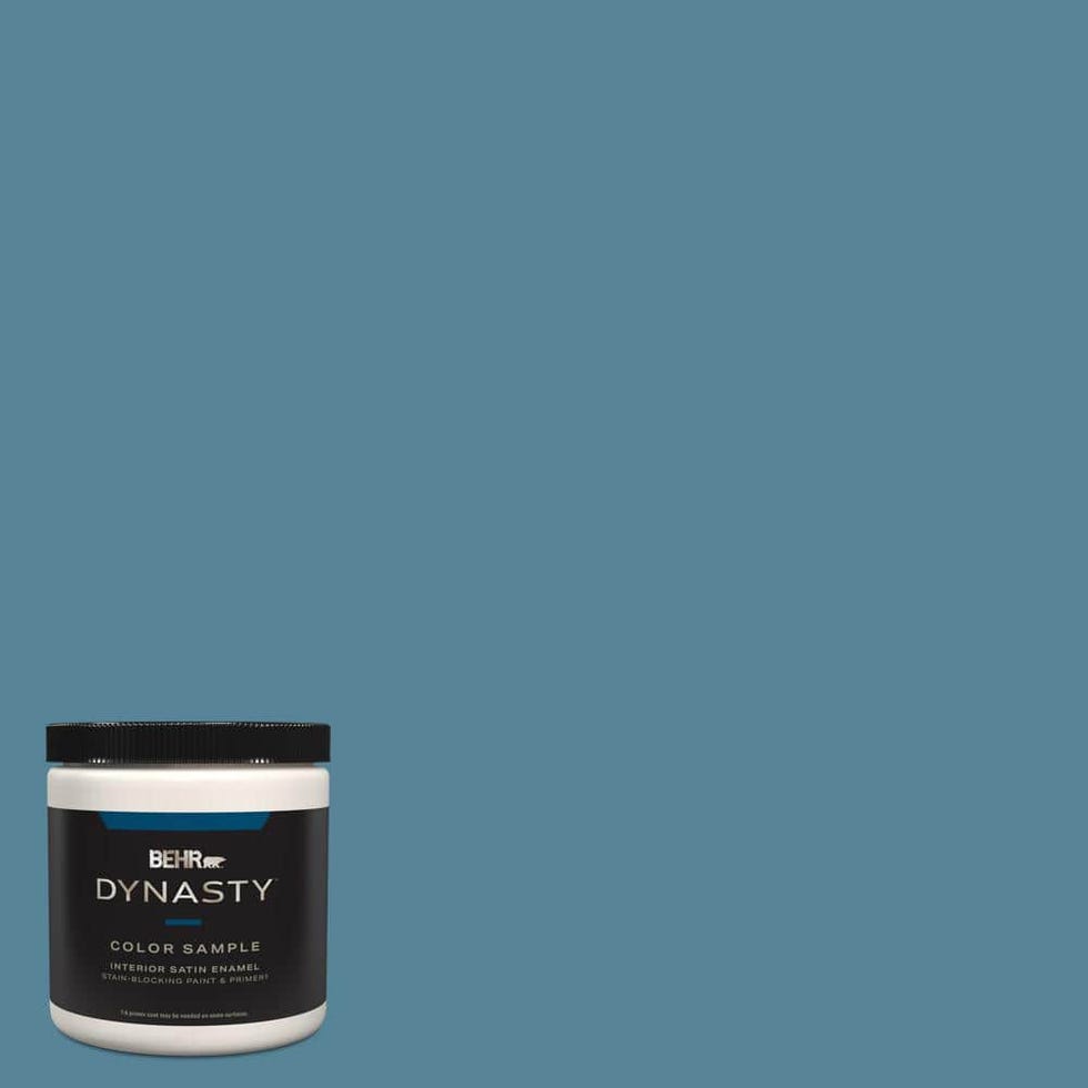
If you want something bolder than navy, go for dark teal. Designer Denise Morrison of Morrison Interiors likes to use this deeper tone to add richness and sophistication to a room. The depth of a dark teal draws the eye, playing with shadow and light in a way that enhances dimension and creates a deliberate, layered look. It uses brass for added warmth and a touch of luxury, and balances with neutral elements like soft beige accents and light wood-paneled walls. That also makes things easier.
Plum purple
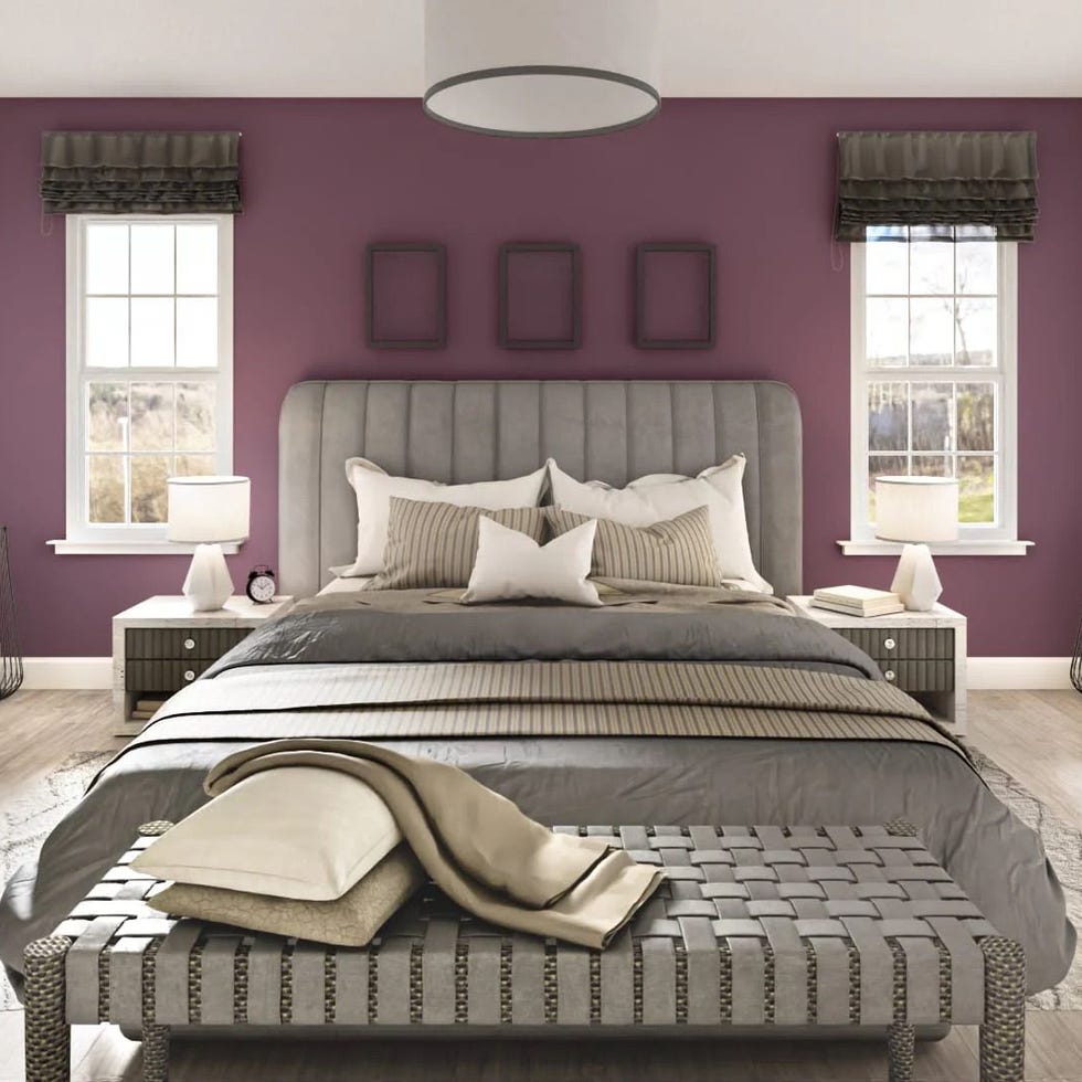
The color purple is associated with royalty, so it only makes sense that it would add a rich, luxurious feel to a room. Plum, eggplant, amethyst—these highly saturated hues “create depth and elegance,” says Linda Eyles. She likes to brighten them with gold to create contrast. Mary Patton adds that this luscious hue is also extremely versatile and can complement a wide range of colors, such as other jewel tones or even bolder options like tangerine orange.
Cream colored
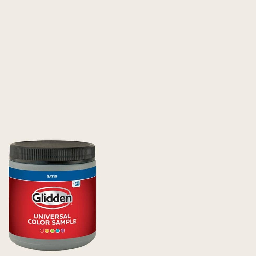
Do you prefer white walls to colorful ones? Well, there's an expensive color for you too. “With the abundance of open floor plans these days, I find that a cream or soft white color immediately exudes elegance and luxury because it creates a clean, calm and timeless backdrop,” says Liz Williams. An off-white is bright without being too stark or cold. Since it is one of the most neutral shades, it is popular for its versatility. It can highlight bolder design elements, Williams adds, or serve as a simple backdrop for a minimalist space.
Creamy white is another color that goes with everything, but for a truly luxe look, Williams emphasizes the importance of combining creamy white with rich textures like velvet and gold accents. When it comes to color combinations, she chooses deeper hues such as dark green, navy blue and chocolate brown, as well as wood tones to add warmth and a premium, elegant feel.
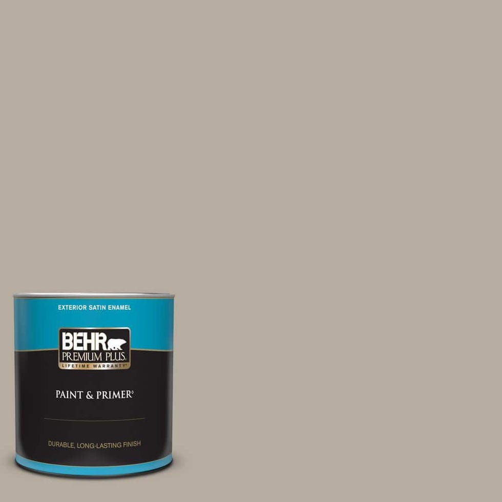
Smoky taupe
When designer Holly Kopman chooses a rich hue, she opts for “colors that feel like suede when you look at them.” Lately, she's been reaching for a smoky taupe shade that's soft to the touch. It gives a room more depth than white or off-white without being overpowering.
If you're looking for elegant pairing ideas, try smoky taupe with robin's egg blue or a rich green, or a crisp white for something brighter.
Charcoal
A dark shade of gray, especially in lime color, looks particularly fantastic and elegant for designer Becky Shea. The depth and richness that comes from the subtle texture is timeless yet modern, and the uneven surface gives the space an organic quality. A matte charcoal gray adds, as she puts it, an “understated opulence” and can help envelop the space in a way that feels intimate and cozy, yet moody and sophisticated.
You can combine a charcoal gray tone with many different textures, materials and shades to achieve a sophisticated feel. However, Shea loves polished brass, marble, rich wood tones and soft textiles under soft, diffused lighting to really give an interior a harmonious and grounded feel.
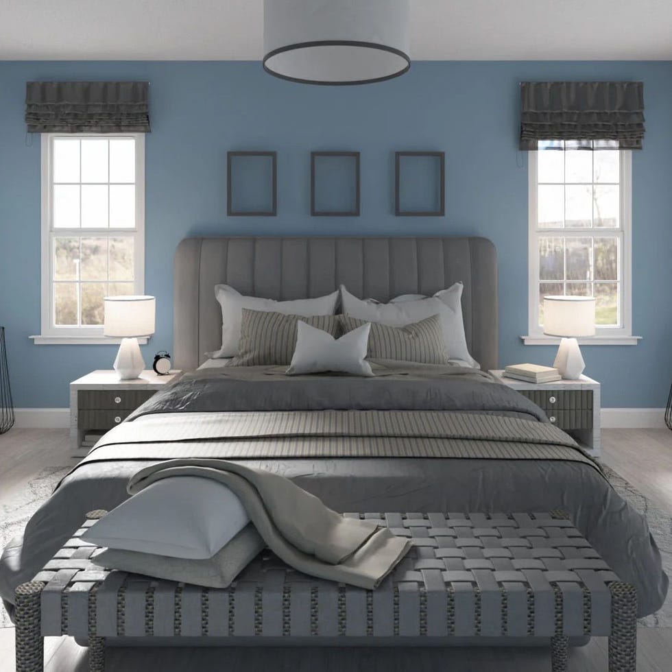
Dusty blue
A dusty blue is usually lighter than navy blue, but not as bright. It is another hue that designers like to use to make a home look more expensive. “These rich and complex hues feel both modern and nostalgic, inspired by the deep hues of old textiles and worn patina,” explains designer Erica McLain. Since a dusty blue is a mix of blue and gray, the hue adds a touch of tailored elegance.
For designer Arianne Bellizaire, this complex color feels tailored and looks sophisticated on furniture, woodwork or walls. Other shades that this shade works well with include crisp whites, warm metallics, and light wood tones.
plaster
Instead of a specific hue, Kim Gordon of Kim Gordon Designs likes to add texture to a wall for an expensive look. From lime plaster to clay plaster, they give an elevated and sophisticated look to a traditional bright white, she says. No matter what color you choose, a textured surface on the walls always adds a touch of elegance.
If you want to go more traditional, Gordon recommends pairing a white plaster wall with jewel-tone accents.
Celery greens
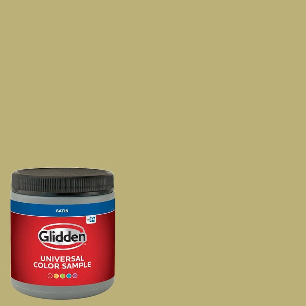
Many of the colors that make a home look more expensive tend to be darker, but designer Tom Riker of James Thomas opts for something bright: celery green. “Green tones characterize the kitchen design and we love how this hue extends into the adjacent rooms, allowing the eye to rest and fully enjoy the breathtaking views and fine textiles,” says Riker. This bold choice, especially when used in a high gloss finish, adds lots of light and cheer to a room.
Since celery green is already such a statement, opt for off-white and dark accents paired with the shade for depth and dimension.
Follow House beautiful To Instagram and TikTok.

