It's no secret that paint is one of the easiest and most cost-effective ways to add personality to your home. But contrary to popular belief, you don't have to limit yourself to a single color per room. In fact, thoughtful color combinations go a long way toward making your space feel layered, beautifully curated, and super chic. Each color conveys a unique mood and energy, and the right combination creates the perfect balance between sophistication and surprise. But which colors should you choose? And how can you be sure that conflicts will not arise? We spoke to interior designers about their favorite color combinations and how they use them to add intentionality, depth and character to their spaces. After all, it takes two (paint colors) for something to go well!
Olive & Light Brown
Mike Van Tassell
Olive walls are hugely popular and reflect the earthy aesthetic of the '70s, when the hue was seen on everything from carpets to kitchen appliances. Designer Beth Diana Smith loves combining olive with classic tan. “The olive green adds body and depth, while the tan provides warmth and natural grounding,” she says. In this chic but homey living room, she used Rosepine and Seasalt from Benjamin Moore. Together, the two colors bring the outdoors into the house while still appearing sophisticated and timeless.
Terracotta and blush
The queen of color, Justina Blakeney, is a big fan of shades in the “red-orange-coral spectrum” because they immediately “exude warmth and joy.” As for specific color recommendations, she loves Benjamin Moore's Golden Gate and Fiery Opal. If you want your space to always feel like it's golden hour, these colors are for you. “Golden Gate anchors the space with sunlit energy, while Fiery Opal gives it a lighter, playful touch. It's a celebration of heat, passion and autumn light.” And because the shades are so similar, they work wonderfully together.
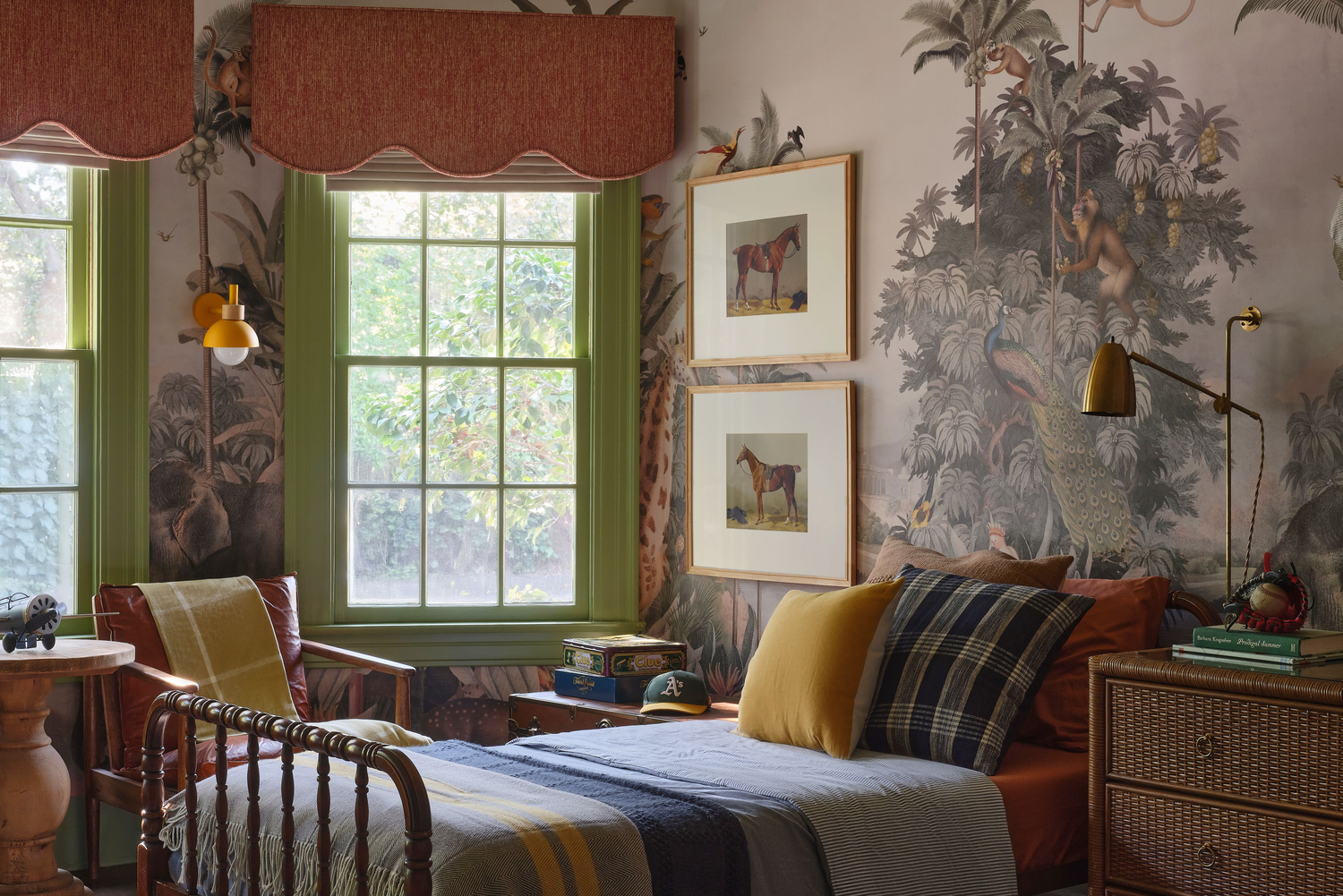
Burgundy and gold
Erin Konrath
When designing spaces, designer Kathryn Murphy looks for “complementary pairings” on the color wheel. If you're not sure which shades work well together, she suggests starting with colors that are opposite each other on the color wheel. Lately she's been drawn to deep burgundy tones with gold accents. In one living room, she painted the ceiling a rich burgundy – don't overlook the fifth wall's color potential! – and combined it with an elegant gold wallpaper with a stork motif. The result feels both warm and luxurious, while the gold keeps the room bright and inviting. This color palette feels especially cozy and festive in cooler weather and will carry the room beautifully through fall and winter.
Umber and steel blue
Delina Langridge
“I'm currently obsessed with steely blues and warm, umber reds combined this fall,” says designer Kelsey Grose. She brought this toilet to life by painting the window and door frame a soft umber that perfectly matches the muted blue-green wallpaper—not to mention the adorable duck design. For accents, she recommends Benjamin Moore's Dark Nut Brown: “It's the perfect mix of depth, neutrality and moody color that I'm craving this fall.”
Sage and plum
Kate Starkel
Designer Amanda Jacobs leans toward a “strong plum tone against a soft, light green.” For this project, she covered the hallway connecting the kitchen and dining room in a deep plum tone, creating a striking contrast to the sage-colored kitchen. “Seeing the two colors side by side feels both alive and grounded—warm, natural, and reminiscent of the purple leaf tones of fall,” she says.
Steamed Chartreuse and Avocado
Amy Bartlam
“We love the monochromatic color-blocking feel,” says interior designer Alexandra Azat. To achieve the effect, she recommends choosing colors that have a similar base tone. For an upscale and vintage-inspired nursery, she combined Farrow and Ball's Churlish Green, a light green with yellow undertones, and Farrow and Ball's Yeabridge Green, a vibrant avocado green. Although these are different shades of green, they differ in “tone, depth and temperature, which creates both harmony and contrast at the same time,” explains Azart. The result is a child's room that's equal parts playful and swoon-worthy.