In architecture there are a number of basic principles that, when properly followed and implemented with a reasonable degree of skill, result in a “good” (not necessarily inspired) design.
As far as I know, these principles are taught at the beginning of their studies at every renowned architecture school and then consistently followed by competent educators.
Unfortunately, these basic principles are neglected, ignored or misapplied by far too many practicing architects, resulting in poor designs that, when built, assault the public's senses through inferior architecture.
Additionally, these fundamentally flawed buildings generally compromise the quality of the associated streetscape, neighborhood, and community. To use an analogy, they are like a giant wart on the nose of an otherwise attractive face – you just can't look past the wart to see the beauty of the face.
In very simple terms, let's define eight of these basic principles.
Consideration of “site” provides the framework within which a design can establish a harmonious relationship with its surroundings, which include, but are not limited to, the landscape, topography and surrounding building architecture.
In short: good design complements and enriches the environment. Conversely, the design will fail if it dominates (or is inconsistent with) the site rather than integrating with it.
“Order” is the basic principle of the design, based on basic human predispositions that allow the average person to read the building intuitively.
For example, walls, openings and spaces must be organized to create a natural flow that says without words or thought: Here is the access, the entrance and the way to move towards and around the building.
The best designs have a level of organization that intuitively conveys the location and purpose of everything in the building.
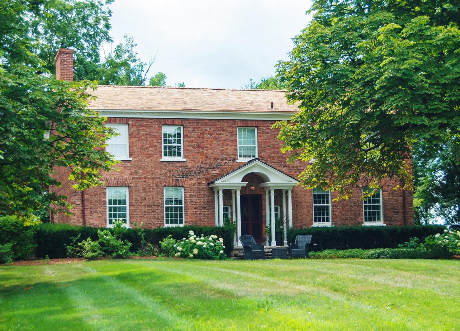
To achieve visual harmony and perceptual stability, the design must be “balanced” – a building facade where the left half has exactly the same visual weight as the right half.
The simplest example is the classic Georgian symmetrical facade, whose main entrance is exactly centered and whose openings (size and shape) are identical and placed in the same positions on the right and left sides.
However, if the main entrance is not centrally located, the architect must properly use massing, shape, color, proportions, placement/location of elements, material combinations, etc. to create the visual impression that one side of the house balances the weight of the other side.
“Balance” complements and reinforces “order” to achieve a design that is accessible, understandable and, above all, appears and feels harmonious.
In short, “hierarchy” is the selective use of secondary and tertiary elements in design to create a visual cascade that irresistibly draws your eye (focus) to the main elements of the building; Therefore, a hierarchy is created from lowest to highest priority.
It is important to ensure that each element used in the visual composition works together to create an intuitive understanding of the design by guiding your eyes and subsequently your movement to natural flowing points in the design.
In combination, the next two basic principles of “scale” and “proportion” play a crucial role in establishing hierarchy while also helping to produce a “calming” emotional response when experiencing a building.
In architecture, scale refers to the sizing of elements according to a known standard – most commonly the human form. Thus, by using scale, the designer can maintain consistency between the perceived size relationships of two specific elements: the elements in relation to the whole and/or the entire composition in relation to the viewer.
Proportion is a mathematical discipline developed in ancient times to calculate/design the various elements of a building composition in order to establish a consistent set of visual relationships between the building's individual components, the components to the whole, and the whole to its context.
Aesthetically complete compositions require the designer to achieve a perceived equality (or relationship) between all elements in the design.
To illustrate this, let's look at the columns on a porch. If the columns are out of scale or inaccurately proportioned, your eye will focus on the columns, which will result in diminishing the overall pattern of the facade, or worse, it will disrupt that pattern and create a subconscious rejection of the architecture.
“Rhythm” and “pattern” are carefully applied in conjunction with the other principles we have discussed, illustrating the natural human attraction to order.
Rhythm can be defined as the regular occurrence of similar and/or identical elements to create a sense of predictability, movement and sequence throughout the visual composition.
Pattern is the introduction of generally decorative surface elements that provide both visual variety and unity.
Here's the key: Elements established in cadence create a sense of rhythm, and “repeated rhythm” forms a pattern.
History has shown us, for very fundamental reasons, that the human psyche is attracted to and feels safe in the order of architecture.
Conversely, chaotic or disruptive building architecture can endanger both individual and community safety.
Our built environment can and should be a stable, secure platform that supports creative innovation. Frankly speaking, launching a spacecraft to Mars on the ocean waves is almost impossible.
To be clear, both traditional and modern architectural expressions can be “good” design – provided the basic principles of architecture are adhered to.
Next week we'll look at these principles in the context of actual design proposals in our small town.
Brian Marshall is a NOTL broker, author and expert consultant in architectural design, restoration and heritage.