Anyone who has ever decorated their home knows the agony and ecstasy of choosing colors. It sounds simple, but it can lead to many arguments between spouses and hours of deliberation. Then, once you've finally decided on the shade, you still need to think about the shade, the finish and even the texture.
However, there are always experts available to share their knowledge and help people make important decorating decisions. Leading designers Róisín Lafferty and Arlene McIntyre, who are supporting Fleetwood to mark its 75th anniversary with the launch of Prestige by Fleetwood, a highly pigmented paint, say the right color can transform a room, but it's important not to be too bold as a hasty decision may not last.
“Rather than chasing trends, I believe colors should always be chosen for their timeless, personal appeal,” says interior designer Róisín Lafferty, whose work includes The Woodland Suites at the Montenotte Hotel in Cork.
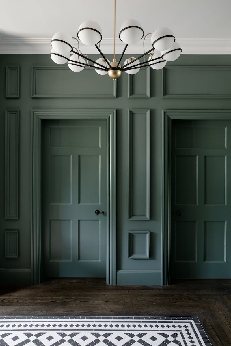
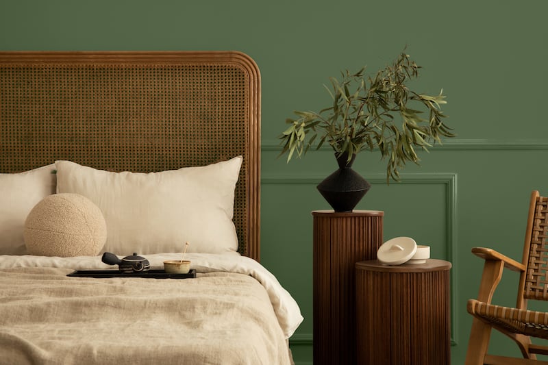
“The shades that really last are usually rooted in nature, with an earthiness and depth that gives them lasting appeal. Think earthy greens like Venice or Necchi, earthy tones like Zallal, or warm browns like Mustang – all from my collection. These shades have a natural harmony that never goes out of date.
“The key is to avoid overly sugary or artificial tones, which can quickly become distracting. Choosing colors that reflect nature will add warmth, comfort and authenticity to a room season after season.
“So when someone asks me for advice, the first thing I always ask is: What atmosphere are you trying to create and what is the function of the room? These two questions should guide your color choices. I've never been a fan of bold walls; they almost always seem like an afterthought. Instead, commit fully to it – wrap the walls, ceilings and even woodwork in a color for an even more intense effect.”
The Dublin-based design expert says choosing a color is a “deeply personal experience” and it is therefore important to design according to your own tastes and needs.
“The best place to start is by asking yourself how you want to feel in the space,” she advises.
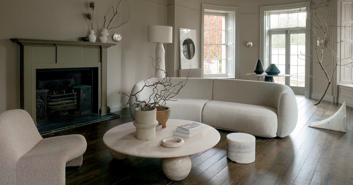
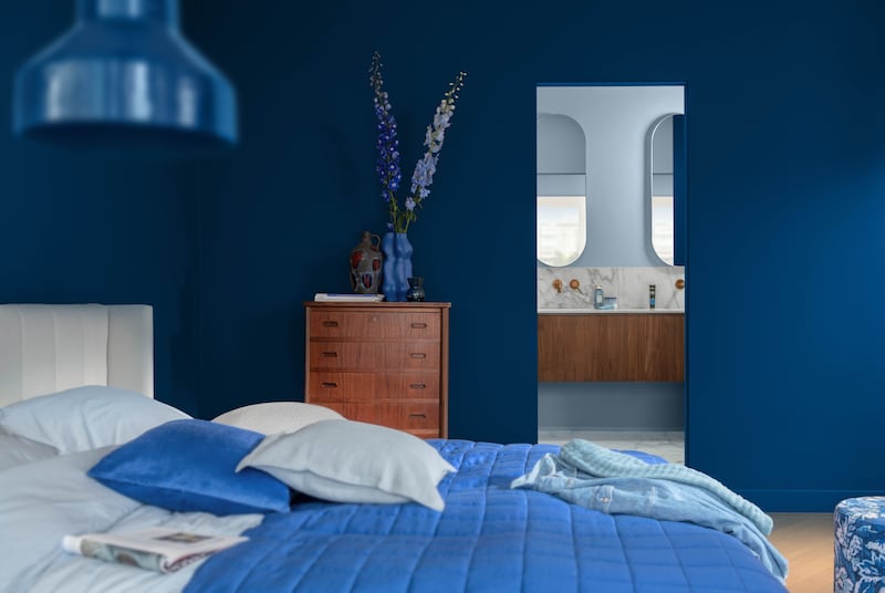
“Bedrooms often lend themselves to softer, enveloping hues such as Water Lilies, Seafoam or the somber pinks Lerici and Tempest. For a more atmospheric retreat, hues such as Orbital or Necchi can be grounding and sophisticated. Living areas, however, can wear bolder, more energetic hues such as Moves Like Jagger or Cobalt.”
“And for dens or home offices, a luxe hue like Fitzwilliam Square creates depth and focus while adding elegance to the room. If a color resonates with you, there's usually a way to make it work.”
She says that one should not make hasty decisions but should do thorough research and planning before starting work.
“My advice is always to paint large sample panels, move them around the room and see how they behave in different light throughout the day,” she says. “Trust your instincts, the shades you are naturally drawn to are the ones you will live happily with.
“Plus, preparation is just as important; proper sanding, priming, and using high-quality brushes or rollers will completely transform the result. And don't just test a small patch of paint, apply large samples of paint, move them around, and watch how the color changes throughout the day in different light. Above all, trust yourself. If a shade makes you feel calm, energized, or inspired, that's the right shade for you At home.”
spatial aspect
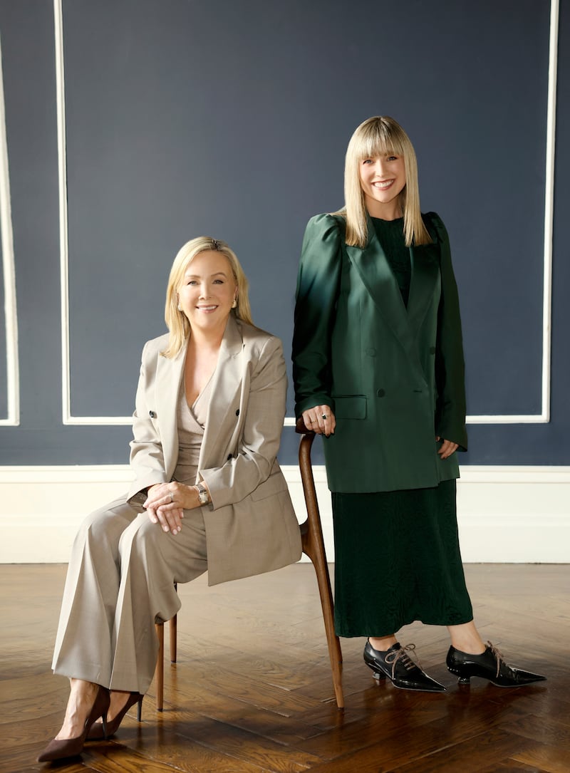
Arlene McIntyre, founder of Arlene McIntyre Design and creative director of Ventura, says you need to think about the light in a room.
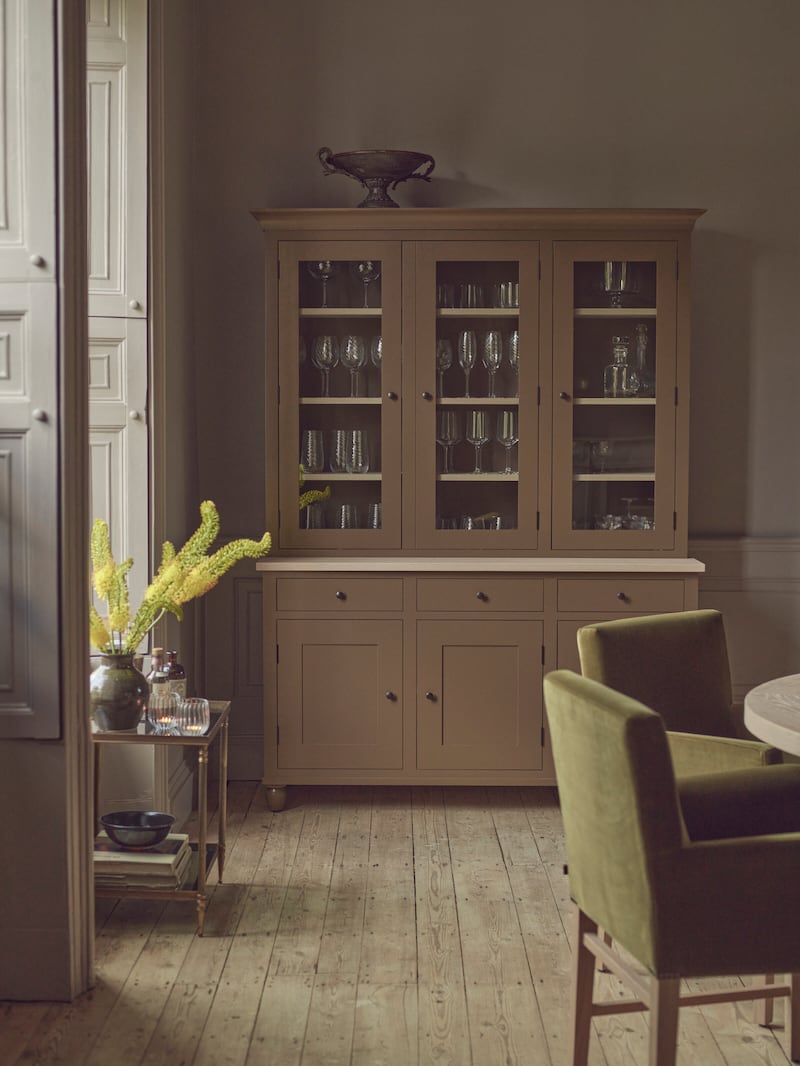
“The aspect of your room also plays a big role. North-facing rooms often benefit from warmer tones, while south-facing rooms can tolerate cooler tones. In general, however, I tend to go for neutral tones as they provide a beautiful backdrop that is both versatile and long-lasting.”
The design expert says this season's fall/winter color trends are about “embracing earthy, autumnal warmth, with grounded neutrals and rich naturals leading the way.”
“I love a warm palette of earthy, equestrian-style tones, I'm thinking rust, burnt orange, ochre, buff browns, olive greens and deep forest tones, balanced with soft, warm whites and neutral stone tones,” she says.
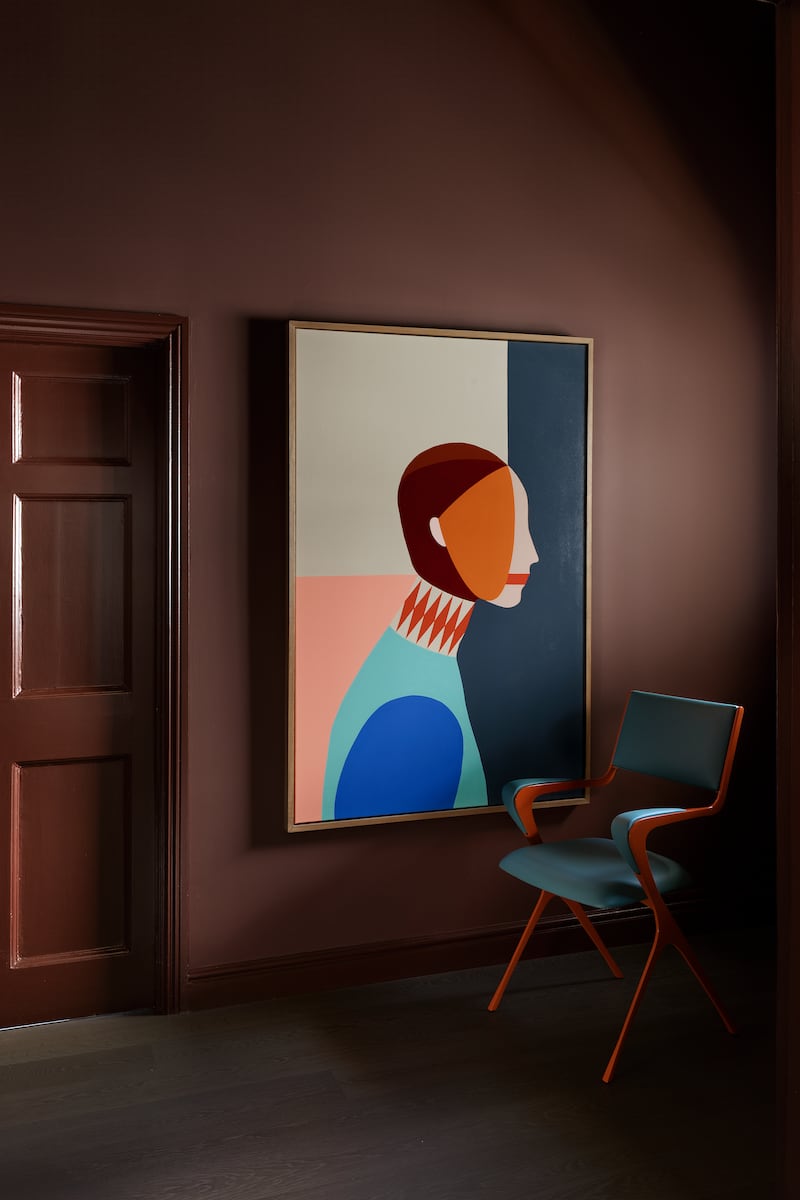
“Muted accents like plum, heather and eggplant add depth and interest, while coffee-inspired hues like mocha mousse provide a calming, enveloping feel.
Neutral or earthy
Nature is also an inspiration at Colourtrend, where the new range is inspired by natural colors found in forests across Ireland.
It's a similar theme at Dulux, where color experts say Irish people are looking for “grounding colors” that make a home feel like a sanctuary.
“There is clearly a trend towards firmly rooted colors that evoke a feeling of calm and balance – this is also being seen globally,” says Jane Witter, color consultant at Dulux Heritage.
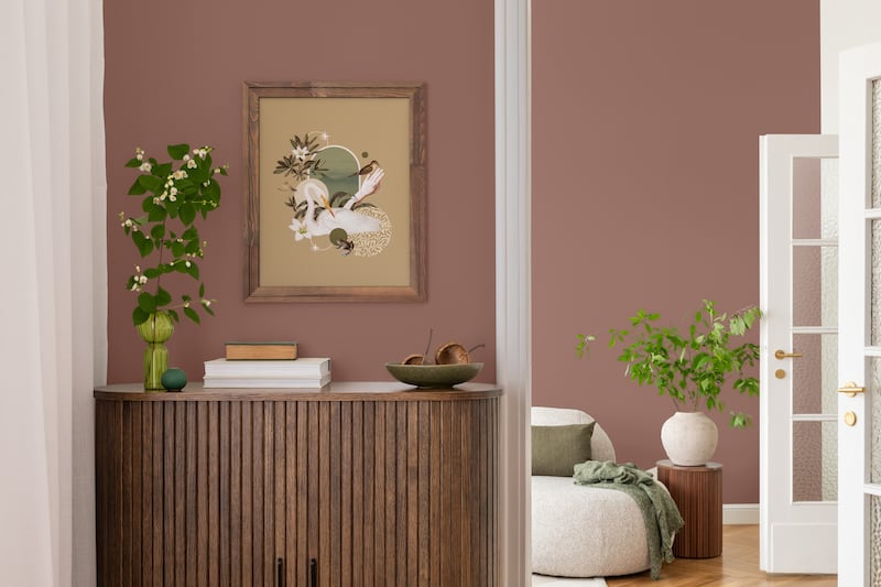
“These are colors that fall into the neutral or earthy spectrum, including deep browns like Dulux Heritage Mud Lark, fresh light greens like Pale Olivine and deeper, richer, warmer neutrals like Raw Cashmere.”
“This shift is driven by the aesthetics of the interiors through the use of anchored natural textures, stone, bronze and marble alongside repurposed and salvaged pieces. And this season we are also seeing darker neutrals such as a rich wine chocolate brown called Cherry Truffle carried over to the joinery and through deeply veined marble countertops and backsplashes.” can be accented while balancing them with a lighter but robust neutral like linseed.”
With so many variables, choosing the right shade for your home can seem like a mammoth task, but McIntyre says there are a number of ways to ensure success.
“Always test your color, try large swatches and look at them at different times of the day,” she says. “And remember the ceiling, it's often overlooked, but a subtle ceiling tone can elevate the entire room. Also, use color to enhance the room, lighter tones open up smaller rooms; deeper tones can make large rooms feel more intimate.”
“Aim for quality and make it personal, your home should reflect who you are. Choose colors that appeal to you emotionally, not just aesthetically.”