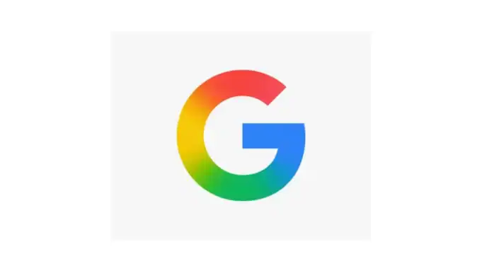
On May 12, 2025, Google presented a subtle yet significant update for the iconic “G” logo for apps and marked the first major redesign since 2015. The new design changes from the traditional solid red, yellow, green and blue segments to a smooth gradient mix of the same colors. This visual update reflects a more modern and dynamic aesthetics in harmony with Google's increasing focus on artificial intelligence technologies and innovations (innovation).
Design development: from flat to liquid
The original -g -logo “G” introduced in 2015 contained various color blocks that represent the core colors from Google.
The 2025 Redesign replaces these solid segments with a seamless gradient and creates a more cohesive and liquid appearance. This change corresponds to the design language, which can be seen in Google's AI initiatives, such as the Gemini logo, in which Blended gradient is used, which are moved from blue to purple, red and pink.
The gradient trend in modern design
A revival has been experienced in recent years and has become a dominant trend in graphic design. They offer depth, dynamics and modern aesthetics that often lack flat designs. In 2025, gradients are used innovatively, often referred to as “Aurora” designs and elements such as granular layers and blurred for dreamy aesthetics.
Newer design updates with gradient elements
Instagram – 2016
Mozilla Firefox – 2019
Asana – 2019
Peacock (NBC streaming service) – 2020
Adobe Creative Cloud – 2020
Microsoft Edge – 2020
grammar – 2022
Spotify (Limited UI symbol use) – 2023
Google (Gemini Ai Branding) – 2024
Google “G” logo – 2025
The introduction of a gradient logo by Google reflects this wider trend and signals a shift to more lively and appealing visual identities. This step can influence other brands to research gradient designs, especially if you try to convey innovations and adaptability in a rapidly developing digital landscape.
Orientation on AI and future technologies
The new gradient -G logo is more than a design update. It is a visual representation of Google's commitment for AI and future technologies. The smooth color transitions symbolize the seamless integration of AI into Google's products and services. This design selection corresponds to the wider strategy of the company to position itself at the head of the AI innovation.
Rollout and user reception
The updated logo began to appear in the Google app on iOS and pixel devices, with plans for a wider rollout on other platforms.
While the change is subtle, it has triggered discussions between users and designers equally.
Some appreciate modern aesthetics, while others consider it a small optimization. Regardless of this, the redesign reflects Google's ongoing efforts to develop its brand identity in accordance with technological advances.
Visual comparison
To illustrate the change, you will find a comparison of the old and new “G” logos:
2015:

2025:

Implications for design trends
The relocation of Google to a gradient logo can create a precedent for other brands, especially in the Tech industry. If companies are trying to convey innovation and modernity, the introduction of gradient designs could become increasingly popular. This trend emphasizes the importance of adaptability and visual engagement for brand identities.
Last thoughts
Google's new gradient -G logo is a thoughtful development of its brand identity, which is based on AI and future technologies with contemporary design trends and the company's focus. While the change is subtle, it means a broader shift towards dynamic and integrated visual branding.
Overall, I like it. This update is obviously nothing important, but a subtle development and modernization. Symbols and app logos that never change are finally stale – like almost everything else in the world of design.
Things that keep circle when it comes to design. So we get skinny jeans, normal jeans, flood jeans and then back to Skinny jeans. Or we go from black hi-fi components to silver and back years later. Hold on something outdated long enough (like granite kitchen poles or a green fridge), and it can happen to return to fashion … maybe.
