When you think of December colors, you probably think of rich greens, deep reds and luxurious golds – the colors you traditionally associate with the festive season. However, if you track the monthly birthstones and their associated hues, December's hue is more summery than seasonal.
Turquoise, a vibrant greenish-blue, is reminiscent of calm tropical waters and warmer climates. But calling it just a summer tone limits it, because turquoise is more versatile and varied than just its lightest form. As with any bolder color, the best way to incorporate it into your home is to choose more nuanced versions – the slightly muted shades that retain its invigorating nature but offer a little less of its vibrant vibrancy.
So if you are inspired by the color of the birth month of December and want to try decorating with this unique blue, we recommend you bring this underrated shade into your home in an elegant and homely way.

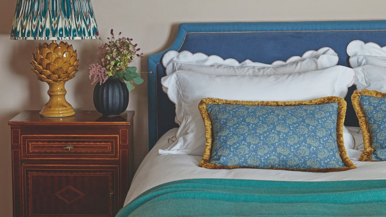
This bedroom is the perfect example of how to decorate with turquoise without overwhelming the space. Turquoise from Edward Bulmer Natural Paint combines with soft yellows and deep reds to create a cozy, layered bedroom.
(Image credit: Future)
First, unless you're going for a very bold look, choose shades of turquoise that are a little more muted – shades like Farrow & Ball's Vardo, Benjamin Moore's Spirit in the Sky, and Behr's Bubble Turquoise. Then you want to pair them with colors that help bring out these softer hues – think ocher yellow, bold red and plum purple. Combining these warm, saturated hues with the blue tones balances out any cooler tones and helps ground the entire color scheme.
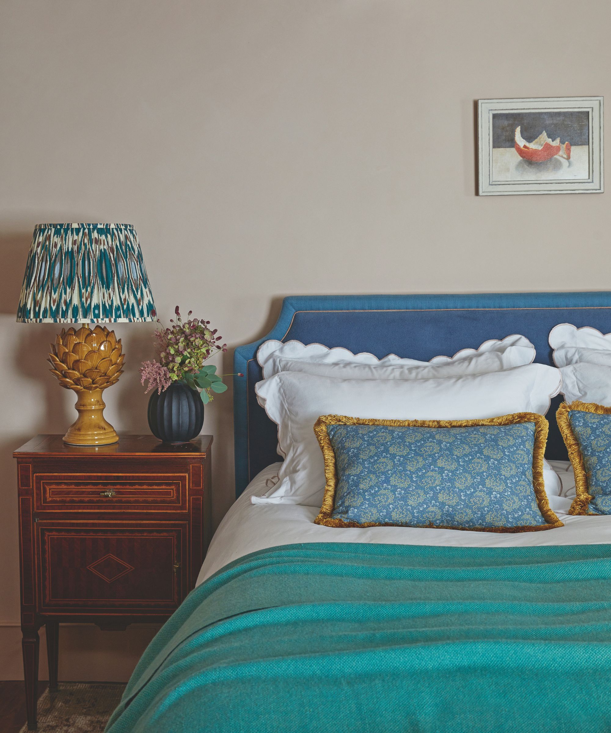
In this bedroom, turquoise appears to be a more comfortable color; paired with a stronger dark blue, soft white tones and warm yellow tones
(Image credit: Future)
Both texture and color layers play a role. You should soften turquoise with tactile materials like velvet, boucle, linen, and jute. Pair a soft turquoise throw – like this tone-on-tone style from IKEA – with cream linen bedding – like this best-selling set from Quince. Or – for more expressiveness – combine a turquoise rug with a larger jute rug to create a relaxed, cozy atmosphere.
Avoid a particular wall. it would look too bare against the surrounding white walls. Instead, opt for a ceiling height. A pale greenish-blue makes perfect sense as a ceiling color, as it mimics the brightness of a soft blue sky above you. In this living room, the ceiling has been painted in Lulworth Blue by Farrow & Ball and looks fresh and invigorating when combined with cream white walls.
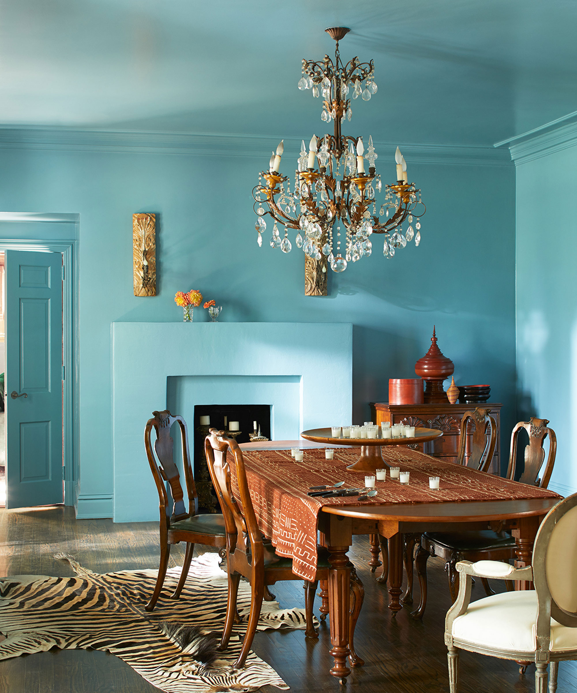
This dining room is bathed in Benjamin Moore's Spectra Blue 2049-50, which looks unexpectedly chic as a backdrop to the antique wood pieces
(Image credit: Benjamin Moore)
Of course, drenching in color is the hottest way to paint a room right now, and teal blues often look best in the right place when you go all in and apply the paint to all surfaces – walls, ceilings, doors and woodwork. Think trendsetter Lucy Williams' iconic blue living room (pictured below), bathed in Farrow & Ball's Yonder. The blue becomes almost neutral and much more subtle than a wall that contrasts sharply with the rest of the room.
Both the blue dining room above and Lucy's living room are littered with unique vintage finds, creating a fascinating contrast to the blue walls. It's unexpected, but it works and adds a fresh and distinctive backdrop to the layered decor.
Shop for turquoise home decor
If you're inspired to decorate with December's color of the month, these turquoise purchases will add a touch of shade to your home – from practical pieces for the kitchen to soft decor for the bedroom. Turquoise is a far more versatile shade than you might imagine.
Turquoise may not be the color that first comes to mind this time of year, but the color of December's birth month can be just as cozy and calming as more traditional winter tones. When used correctly and paired with the right colors and textures, it can actually add warmth to a room, adding depth and creating a layered, inviting atmosphere.